Case Study: How Chef du Nord Found Its Visual Voice
Creating a strong brand identity is about more than picking colors and choosing fonts—it’s about telling a story that feels true. For Chef du Nord, that story is rooted in heritage and inspired by place.
Named with French words to reflect its northern home base and European sensibility, Chef du Nord (Chef of the North) was born from Jackson’s desire to share high-quality heirloom recipes. The idea was sparked by his grandmother’s faded, handwritten notes and fueled by his admiration for European food culture. From the beginning, the brand was meant to feel both nostalgic and refined—grounded in tradition, yet elevated in design. But bringing that vision to life visually took intention, clarity, and the right creative partner.
This case is officially open, so let’s dive in!

A Vision Without the Visuals
Before connecting with Venlo Studio, Jackson knew the heart behind Chef du Nord, but struggled to translate that vision into design. "I had a clear idea of the visual identity in my head, but I had struggled to articulate it to other designers in the past," he said. "Lydia quickly understood my vision and was able to explain and describe it back to me, which instantly made me feel like she knew what I was seeking."

At the time, Jackson had a brand concept from another designer—but it didn’t match the essence of what he wanted to create. Cool-toned, icy colors and overly modern typography made the brand feel sterile rather than soulful. It lacked the warmth, nostalgia, and refinement he was aiming for.
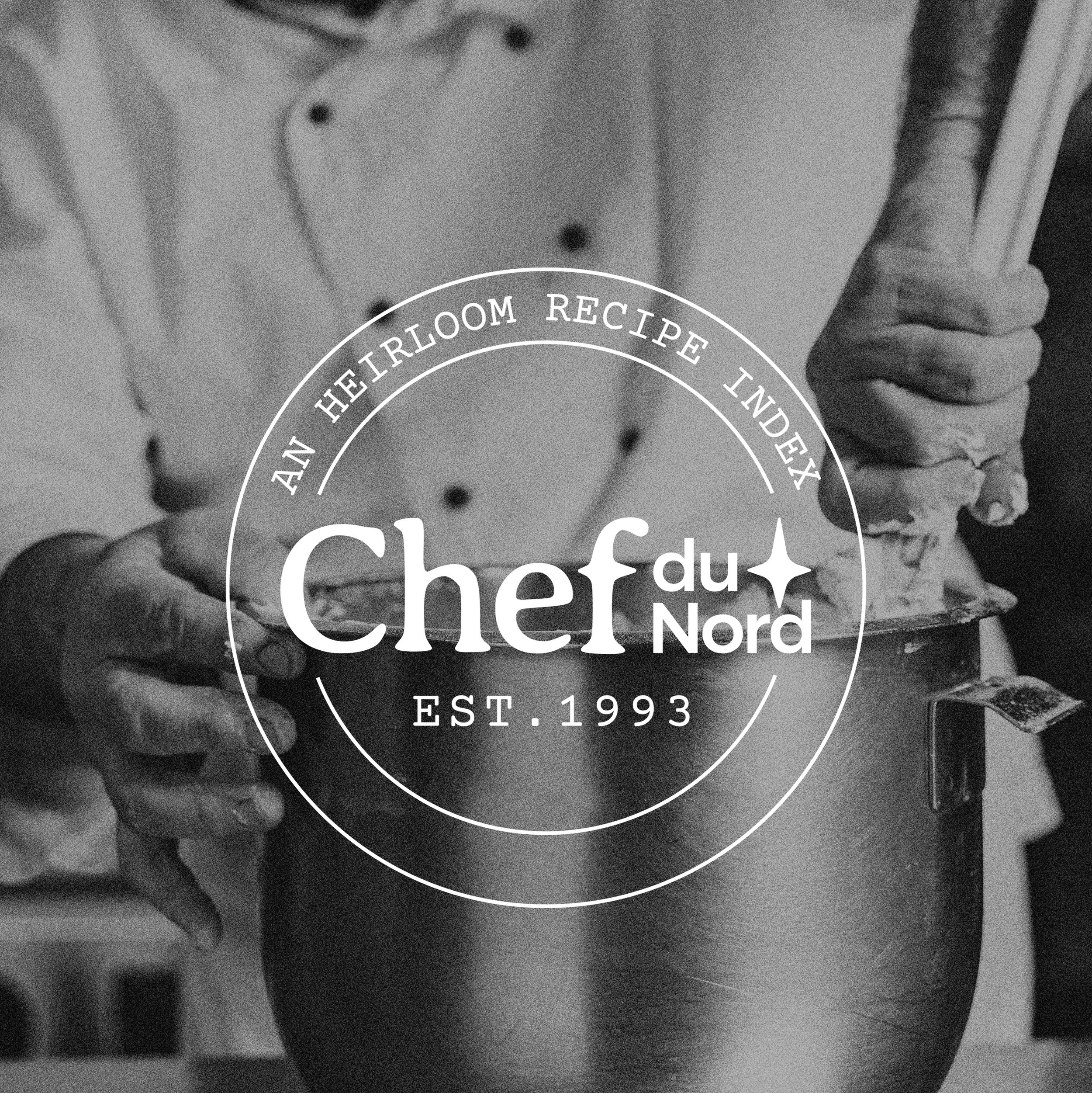
Setting a New Tone
We started the branding process with a moodboard that felt more aligned with the words Jackson used to describe Chef du Nord: heirloom, nostalgic, refined, and inviting. Drawing inspiration from vintage recipe cards and old-world European letterpress, we began curating a color palette that felt both timeless and approachable.

Typography played a major role in the brand's transformation. We explored dozens of typefaces until we found the perfect pairing—one that evoked the feeling of time-worn recipe cards. Every letter was intentionally tweaked, with custom adjustments made to align spacing and enhance the visual rhythm.
The Details that Made the Brand


No detail was left untouched. We added a North Star mark—a subtle nod to Minnesota—into the negative space of the primary logo lockup. For the secondary logo, we drew inspiration from vintage seal stamps to add a layer of heritage and trust.
The final touch? A custom brand pattern built from the North Star symbol, offering a flexible and ownable visual element to use across digital and print materials.
The Final Result
"The final outcome exceeded my expectations; it perfectly embodies the brand's identity," Jackson shared. "The collaborative approach made me feel heard, and I was so impressed with Lydia's ability to capture the spirit of Chef du Nord in the logo and overall branding."
The brand now feels like an extension of Jackson’s story—a refined, inviting, and nostalgic homage to where he comes from and where his culinary journey is headed.
Looking to build a brand identity that feels just right?
Let’s create something meaningful together. Contact us