Case Study: Elevating Bound NOLO’s Brand for a North Loop Storefront
Jewelry has always been about more than style—it’s about story, memory, and connection. For Colleen, founder of Bound NOLO (formerly Bound Permanent Jewelry), her business was never just about accessories—it was about connection.
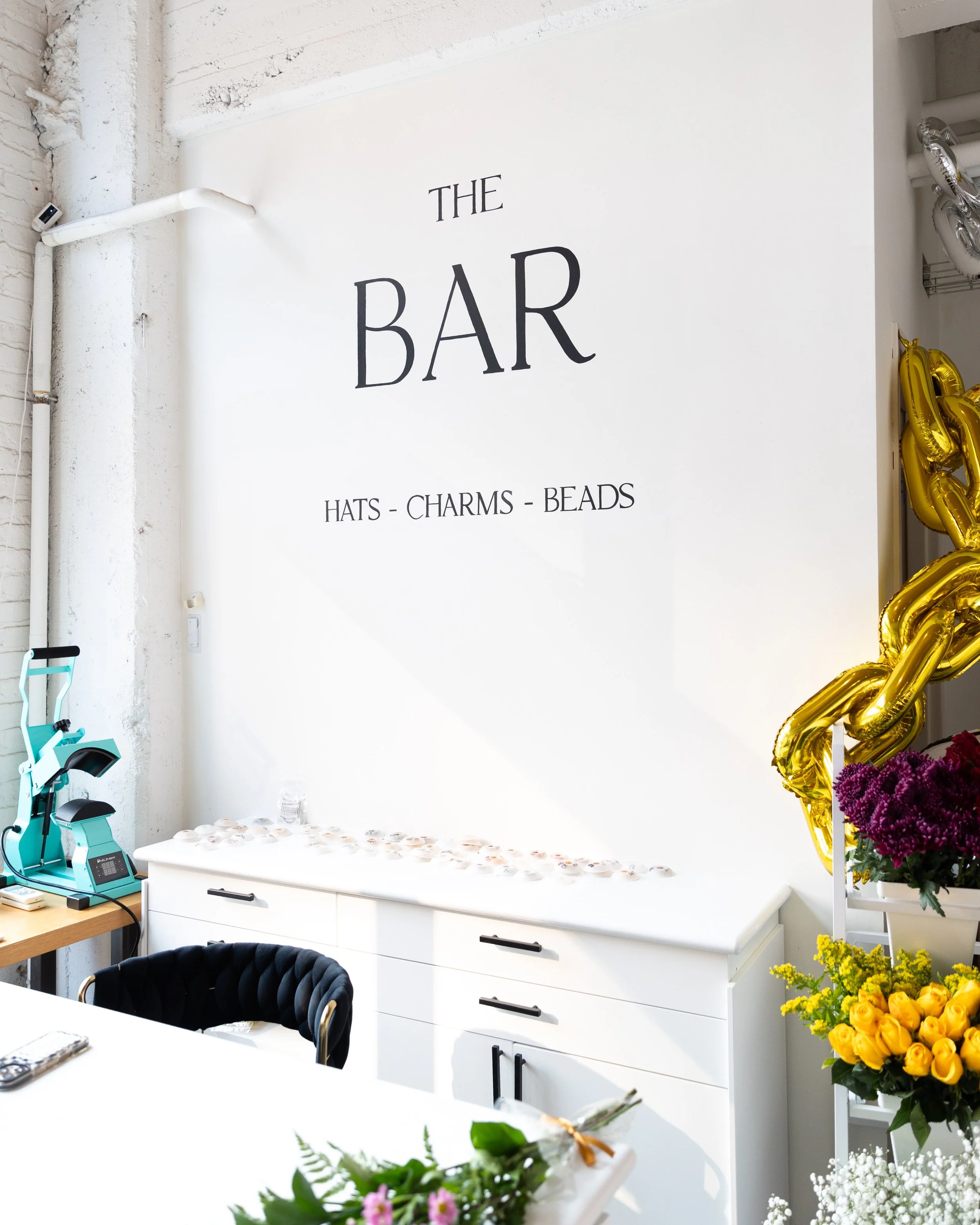
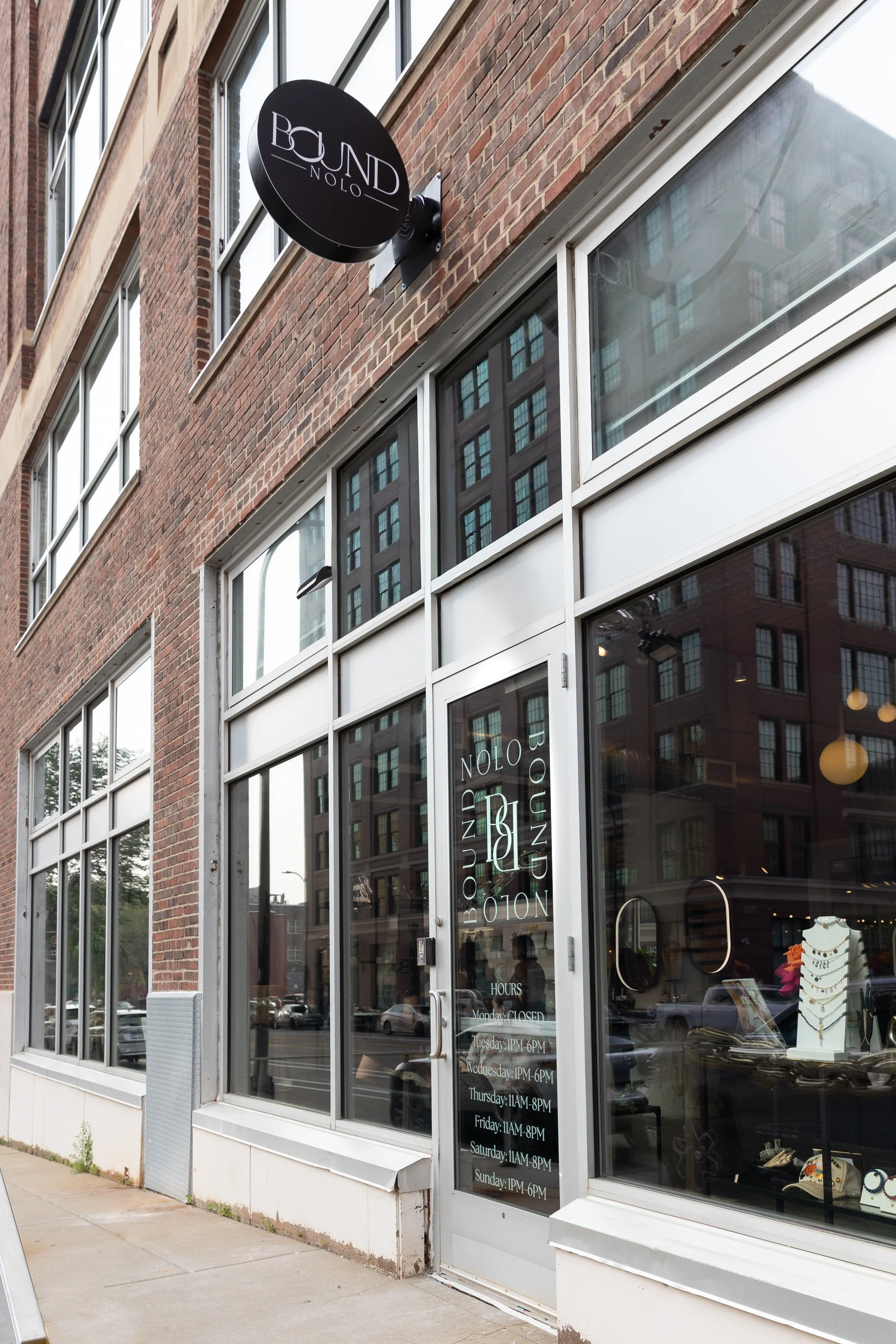
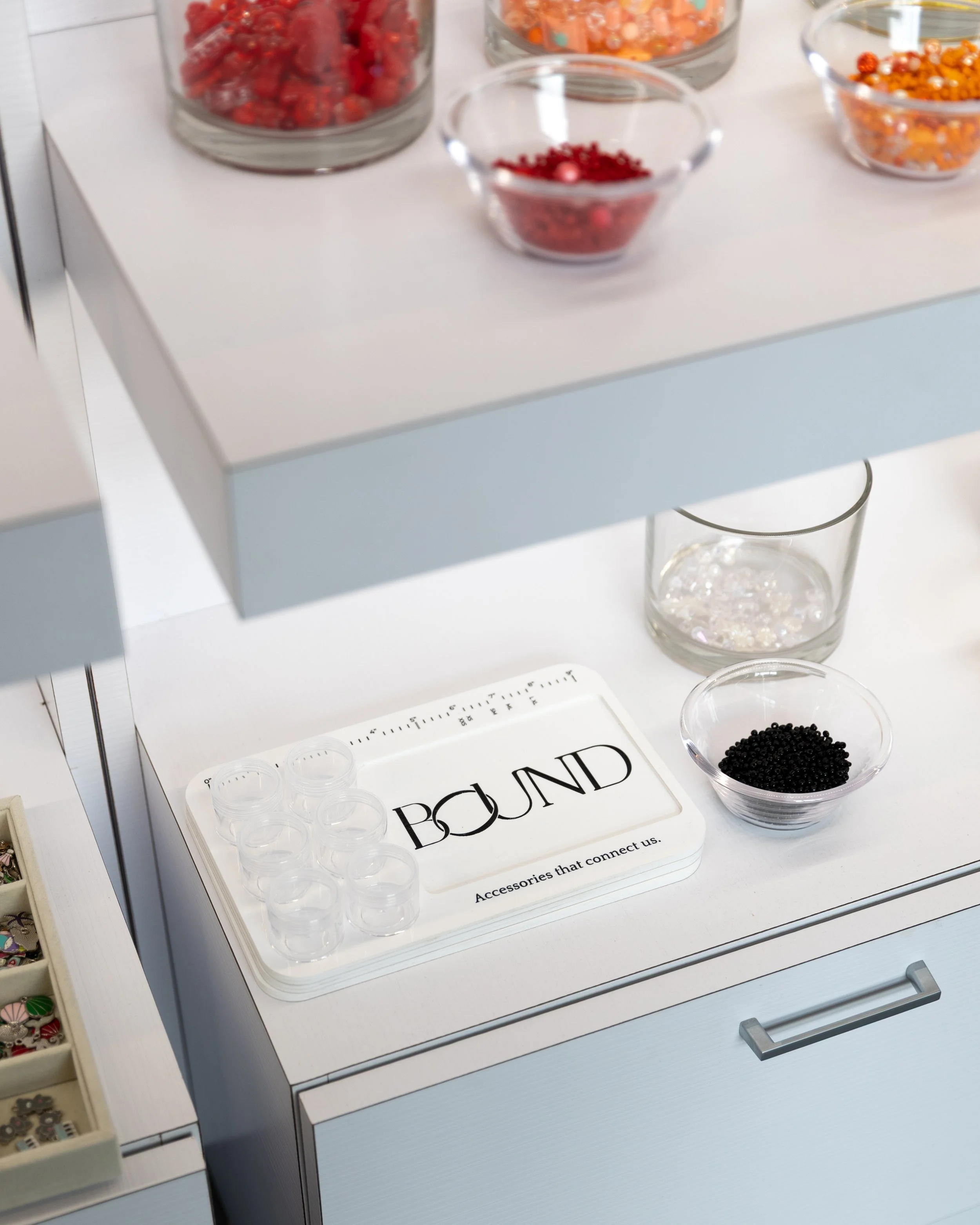
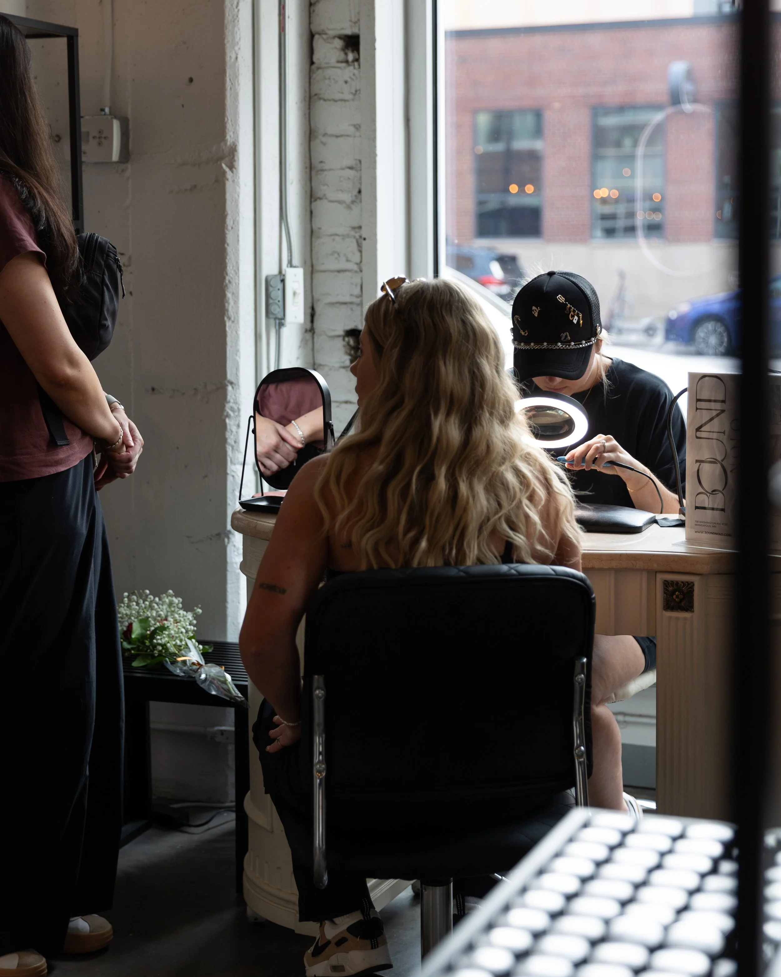
As a woman-owned Minnesota business rooted in the North Loop of Minneapolis, Bound offers ready-to-wear jewelry, a Charm Bar, a Hat Bar, and permanent jewelry experiences designed to celebrate milestones, relationships, and self-expression. But as the business grew and prepared to move into a new storefront with increased foot traffic, Colleen knew it was time for a brand that felt as intentional as the experience she created for her customers.
A Brand Built on Connection
When I asked Colleen why she started her business, her answer was deeply personal.
She shared that she has always felt “bound” to her mother and grandmother when wearing their jewelry—a spiritual connection across time and generations. Jewelry, to her, is more than adornment. It holds stories. It carries memory. It connects women through shared experiences.
That’s where the name Bound was born.
Today, mothers and daughters are some of her most frequent customers. Friends come in together to get permanent bracelets clasped as a symbol of commitment. Women treat themselves to celebrate milestones or simply because they deserve something beautiful. Bound exists to facilitate those meaningful moments.
Colleen’s vision was clear: create a space that makes you feel good. A place to celebrate, to connect, to honor relationships—whether with someone else or with yourself.
Why It Was Time for a Rebrand
For the first three years, Colleen built the brand as she went. She kept things flexible while figuring out the direction of the business. But as she prepared to move into a new North Loop storefront, she knew it was time to solidify the foundation.
“We never really committed to real branding because I didn’t know where this was going to go,” she shared. “Now that I have a better direction, we need professional branding.”
With new signage, increased visibility, and a physical space to design, this was the right moment to invest. A storefront demands clarity and cohesion. And Colleen was ready for expert guidance.
From Concept to Clever Design
After meeting at a networking event the year prior (she held onto my business card until she was ready!), we began the branding process with strategy and exploration.
When we presented two initial brand concepts, Colleen’s reaction said it all:
“My first thought is—you are good at your job. Because I kind of thought I would know immediately, and I don’t! I love them both. They are really awesome.”
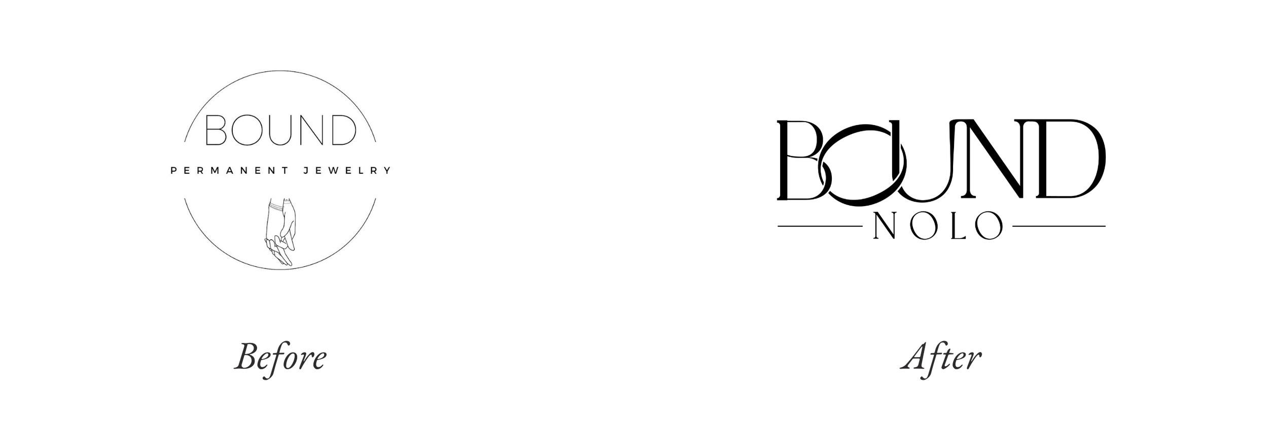
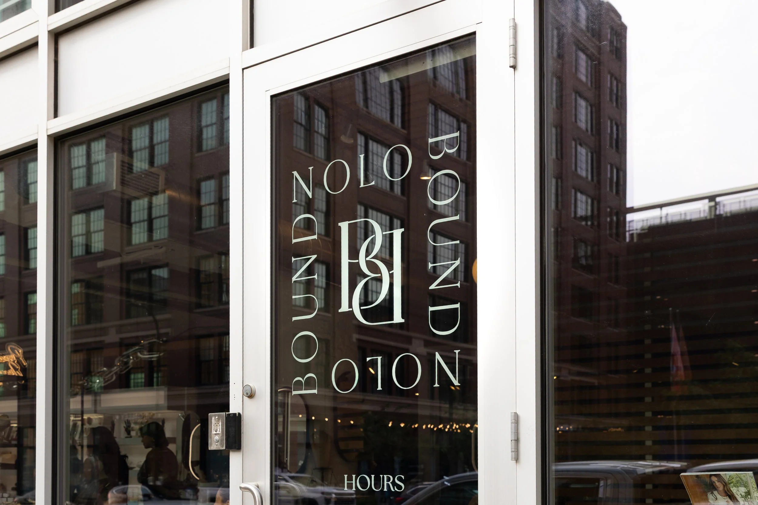
Ultimately, we landed on a type-forward logo design with custom letter work. Every letter in “Bound” connects in some way—symbolizing the interlocking nature of relationships. The letterforms subtly resemble chain links and bracelet clasps, reinforcing the permanent jewelry experience.
The logo feels classy, refined, and elevated—yet still approachable.
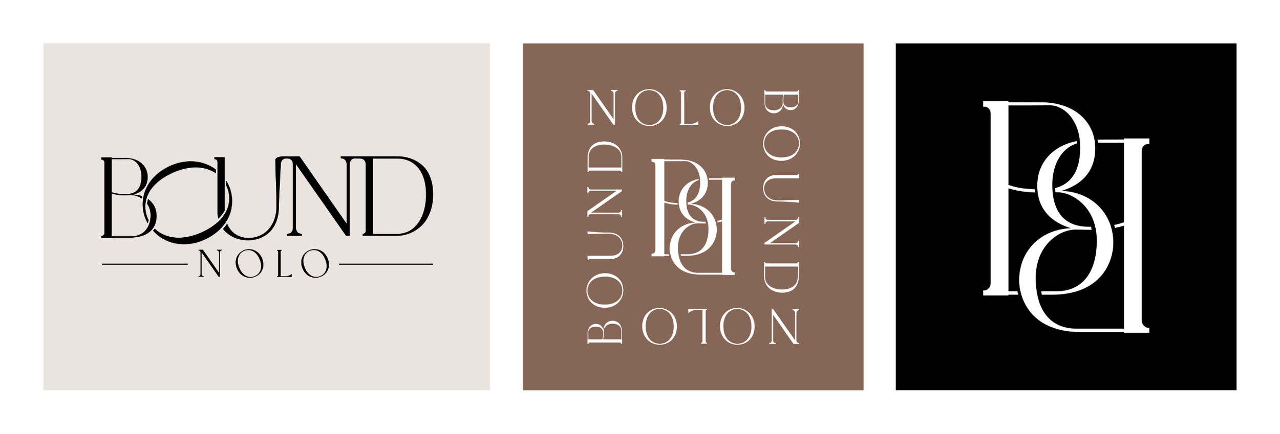
For the secondary mark, we leaned into high-fashion inspiration with interlocking B’s that further emphasize connection and brand recognition.
A Palette and Pattern with Purpose
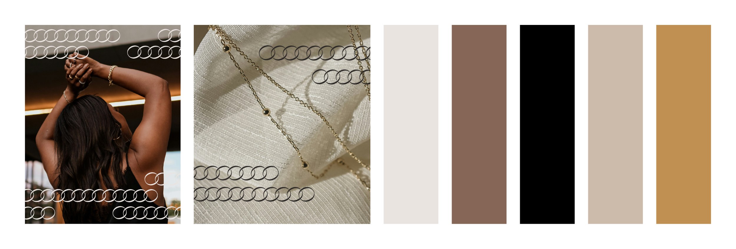
The color palette was designed to feel timeless and inclusive—neutral tones inspired by skin tones and jewelry metals, with the pop of gold. The warmth of the palette allows the jewelry itself to shine while maintaining an elevated aesthetic.
We also developed a custom brand pattern derived from the interlocking “O” in the logo, which subtly resembles a jewelry chain. This pattern gives the brand versatility across packaging, signage, marketing materials, and in-store details.
Seeing the Brand Come to Life
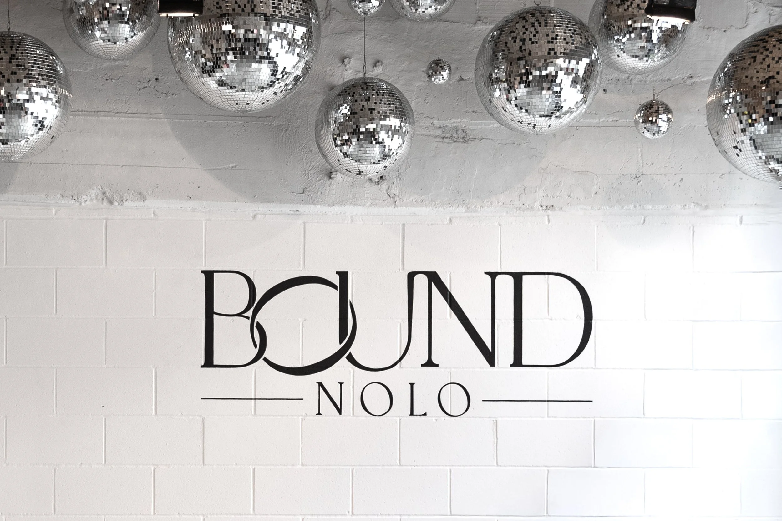
One of the most rewarding moments of the project was attending Bound’s North Loop open house launch party. Seeing the logo hand-painted large on the storefront wall was surreal. Watching customers take photos in front of it. Seeing signage, packaging, and displays come together in real life.
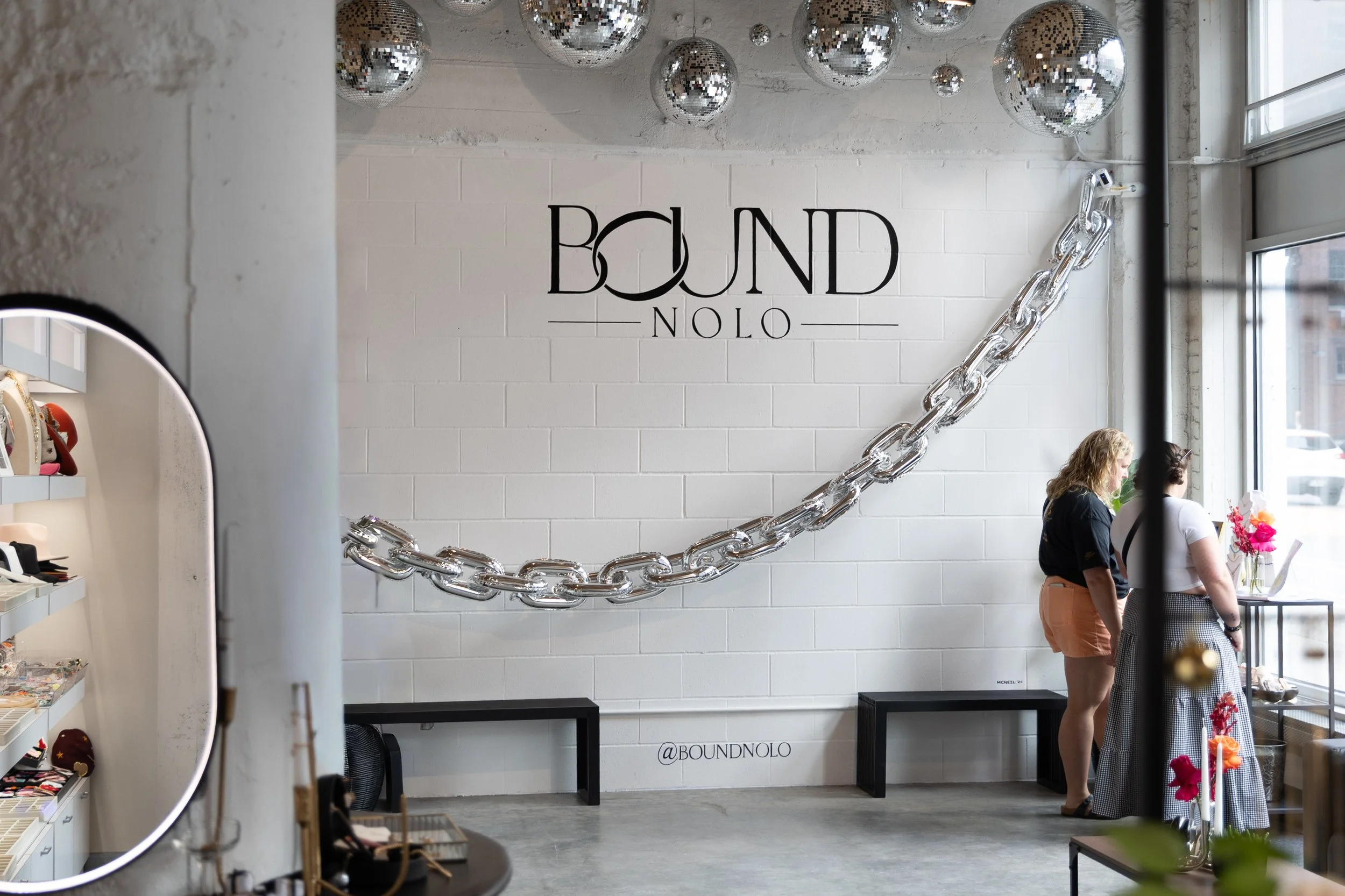
It’s one thing to design on a screen. It’s another to see a brand fully embodied in a space buzzing with energy.
Bound NOLO now has a cohesive, elevated identity that matches the beauty and sentiment behind its jewelry experiences.
If you’re preparing for a storefront launch, a relocation, or simply feel like your brand has outgrown its DIY phase, it may be time to build something more intentional. Let’s create a brand that connects. Start here.